Help Centre
Webpage Redesign

Overview

A rebrand of the Customer Service page for the Royal Bank of Canada.

During my design internship at RBC, I contributed to the refresh of the financial institution's Customer Service page — rebranded as Help Centre — with the goal of improving self-serve features and minimizing dependency on call centres. I collaborated with a cross-functional team including Designers, a Product Owner, Business Analyst, and Developers to create a responsive experience that prioritized the user experience. The project spanned across research, exploration, testing, and implementation.

Timeline

February - April 2023

Overview

The Scope

Prior to the redesign, the existing Customer Service page was difficult to navigate and did not fulfil the needs of our clients. To guide our design process, we asked ourselves "How might we support our clients and enable them to self-serve and complete/answer their banking needs, without having to visit a branch or contact the call centre?" We defined three overarching objectives:

Provide clients with a more efficient self-serve experience

Integrate a new chatbot feature to enable asynchronous support

Align with existing branding and accessibility standards

Design Process

Competitive Analysis

We conducted a competitive analysis across ten financial institutions to synthesize their strengths, weaknesses, opportunities, and threats. We discussed observations regarding the UI, page layout, content, and flow, especially when relating to the chatbot functions and support features.

Snapshot of competitors

Pain Points

We identified client pain points with the financial institution's existing Customer Service page, noting main frustrations such as:

Lengthy wait times with customer service over the phone

Difficulty with locating support services on the website

Lack of time and flexibility to visit branch locations

Wireframes

To determine information hierarchy, our team created wireframes to explore webpage layouts based on user metrics and popular search terms. We aimed to ensure a balance between providing an informative experience, without overloading the page with content. I also rationalized for the ‘Contact Us’ section to be positioned at the bottom of the webpage to encourage clients to self-serve before seeking customer service support.

Wireframes

User Testing

Objective

We conducted user testing with ten banking clients to gain insight into areas of improvement and ensure that our design offered an intuitive user experience. The testing was performed to validate our designs and highlight any potential opportunities for refinement.

Process

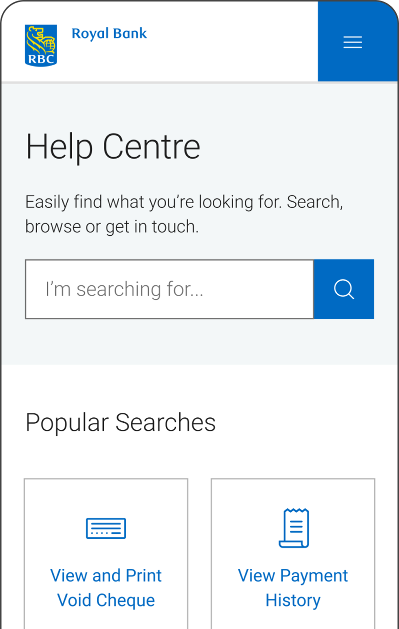
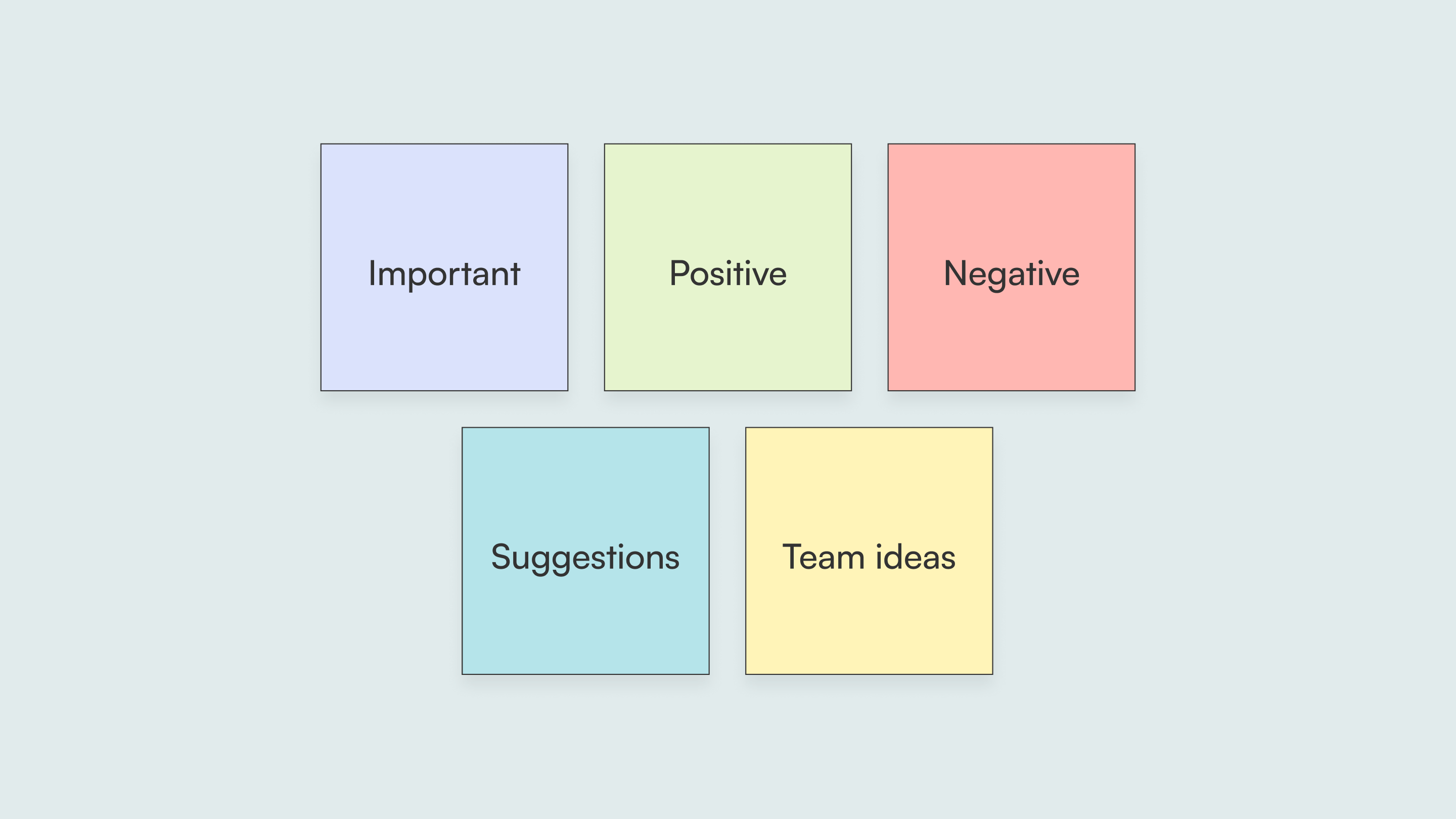
The Design Researcher prepared a research outline and a series of questions to introduce the client to the Help Centre page and prompt further thinking. We hosted ten 30-minute sessions, and I was fortunate to have the opportunity to act as an observer, note-taker, and a moderator on different occasions. Following the sessions, we colour-coded our insights to organize them into 5 categories: important, positive, negative, suggestions, and team ideas.

Colour-coded sticky notes

Takeaways

From the usability testing sessions, we gained a number of insights that supported us with better understanding the client. These were some of the major "How Might We?" questions we developed to guide our process forward.
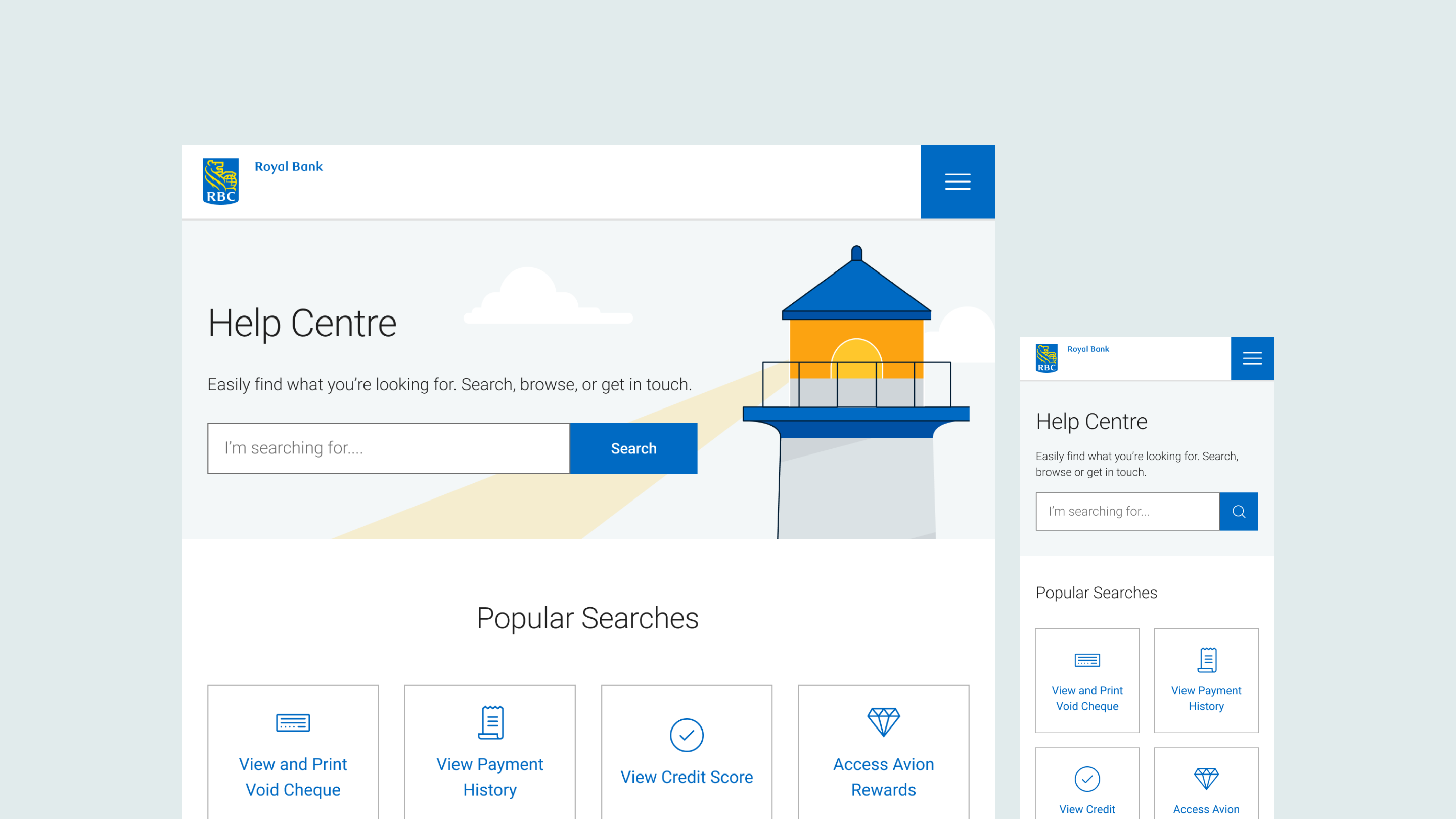
HMW further clarify all of the section headings?

HMW create greater visual interest throughout the page?

HMW ensure that clients are finding what they need?

Design Refinement

To address the updated "How Might We?" questions, we outlined a few of our next steps, including refining the headings to provide further clarity and rearranging the categories to support clients with locating key information.

Next Steps & Takeaways

Moving Forward

Unfortunately, my internship term ended before we were able to complete the Help Centre page. To finalize the project, we would have verified accessibility standards throughout development and conducted internal testing to ensure proper functionality. Post-launch, we would have measured metrics to evaluate success and leverage the data to identify changes for future iterations.

Reflection

From research to refinement, RBC's Help Centre redesign was a key learning experience that deepened my understanding of the impact product design could have on the client experience. It demonstrated the power of cross-functional collaboration and continuous iteration which, in combination, amplified our knowledge and capabilities, enabling us to balance meeting business objectives with addressing client needs.

Desktop and mobile screens

Return to Homepage