Gyve
Mobile App

About

By streamlining the donation process, encouraging the act of gifting, and empowering charities to share their needs, Gyve makes it easy to make an impact.

Timeline

October - December 2022

Gyve hero image

Introduction

Overview

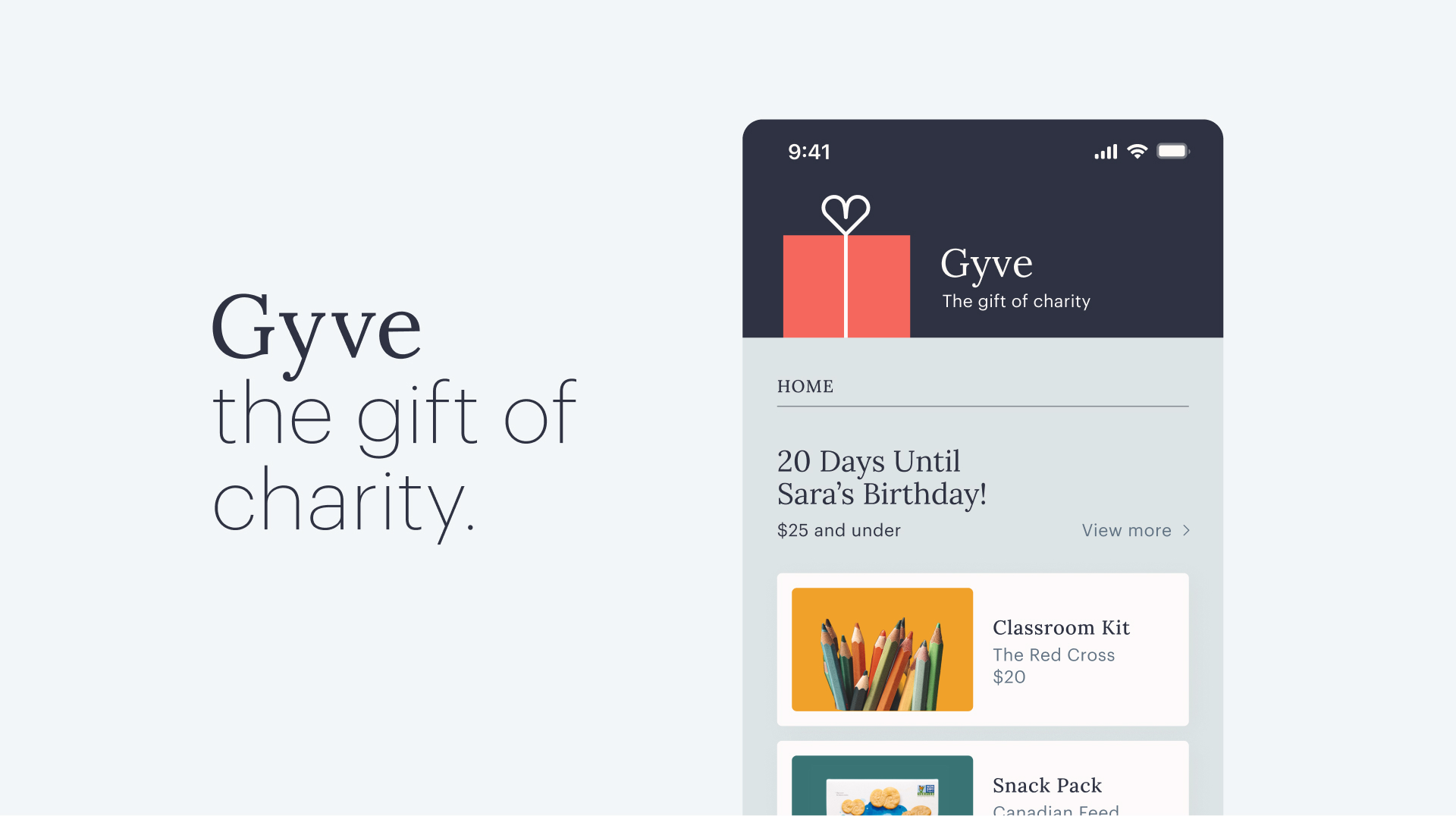
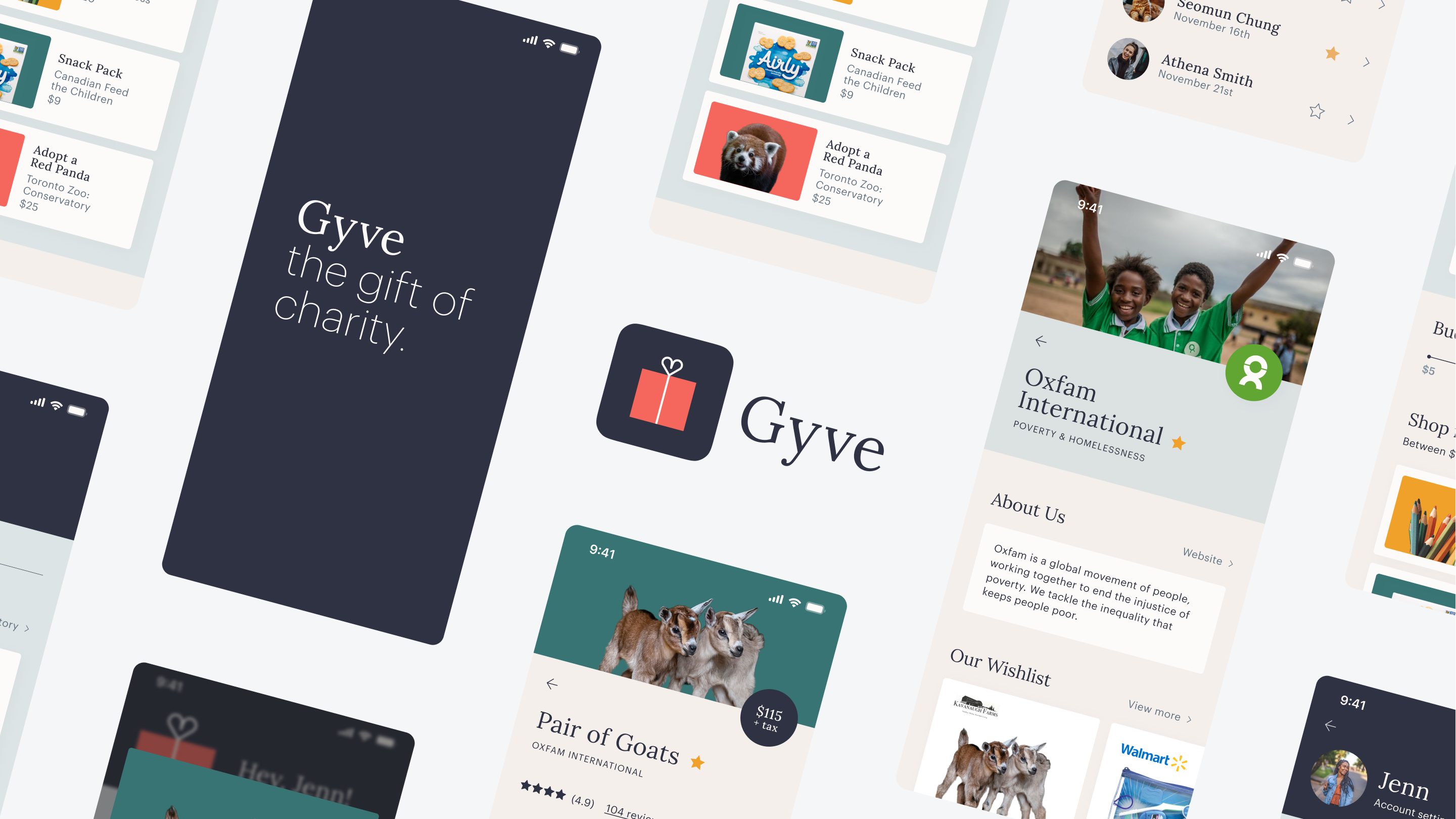
Gyve is a mobile application designed to transform charitable donations into personalized gifts. The app streamlines the donation process, curates recommendations, and empowers charities to share their needs — making giving more transparent, social, and impactful. As the sole product designer, I led the end-to-end design process, including competitive research, visual design, and prototyping.

Project Scope

To drive the product design process, I asked “How might we create a seamless charitable gift giving experience that emphasizes usability, impact, and connectedness?” Individuals are more likely to make charitable donations when they receive insight into the impact of their money, and are often hesitant when they feel a lack of transparency. Gyve aims to bridge the gap between these intentions and actions by empowering users to have autonomy over how they allocate their donations and build purpose through community connection.

Shuffling taglines

The App

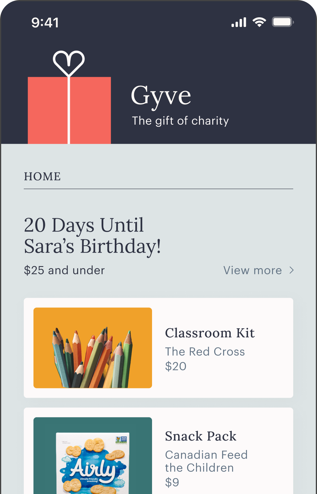
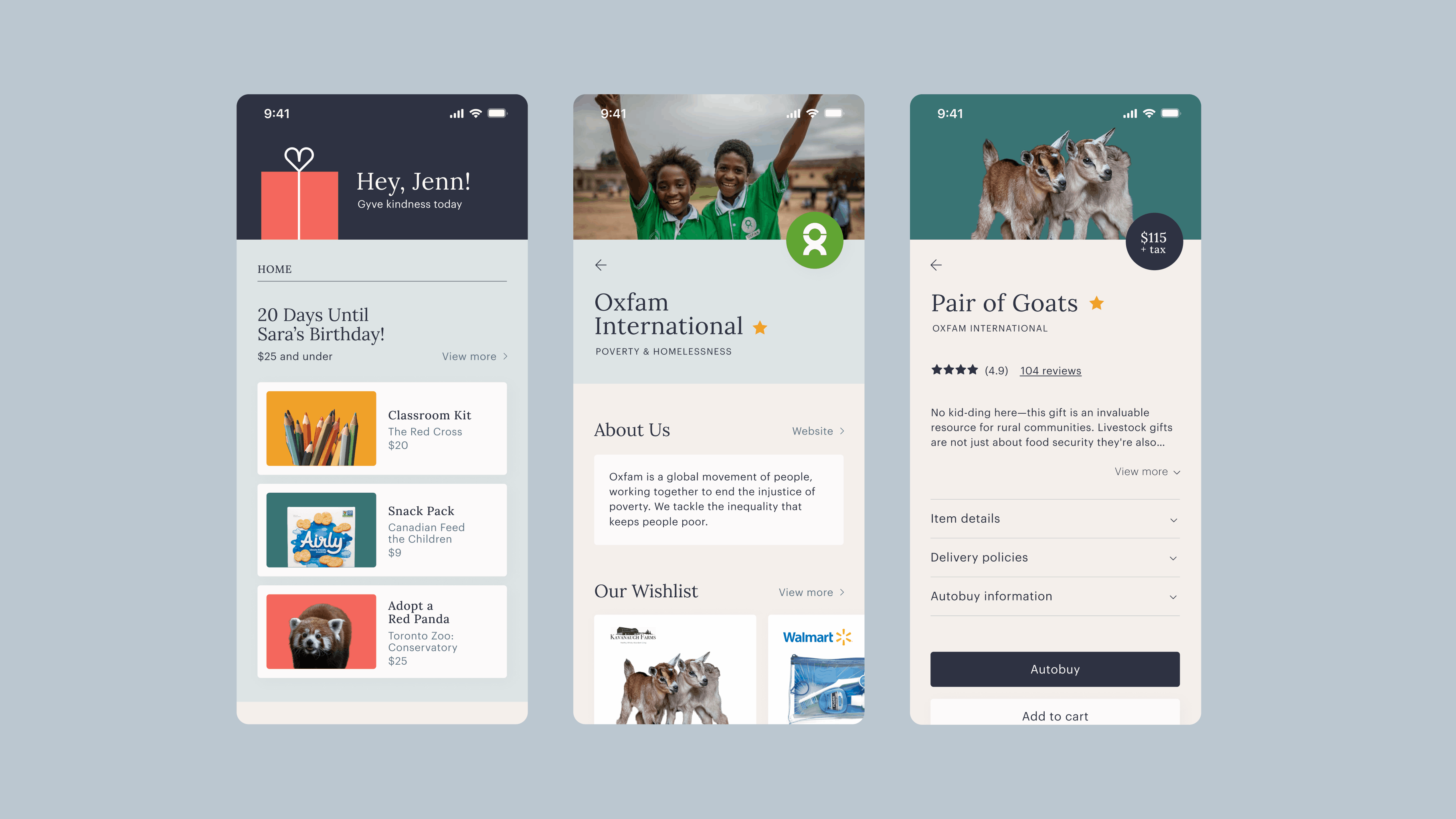
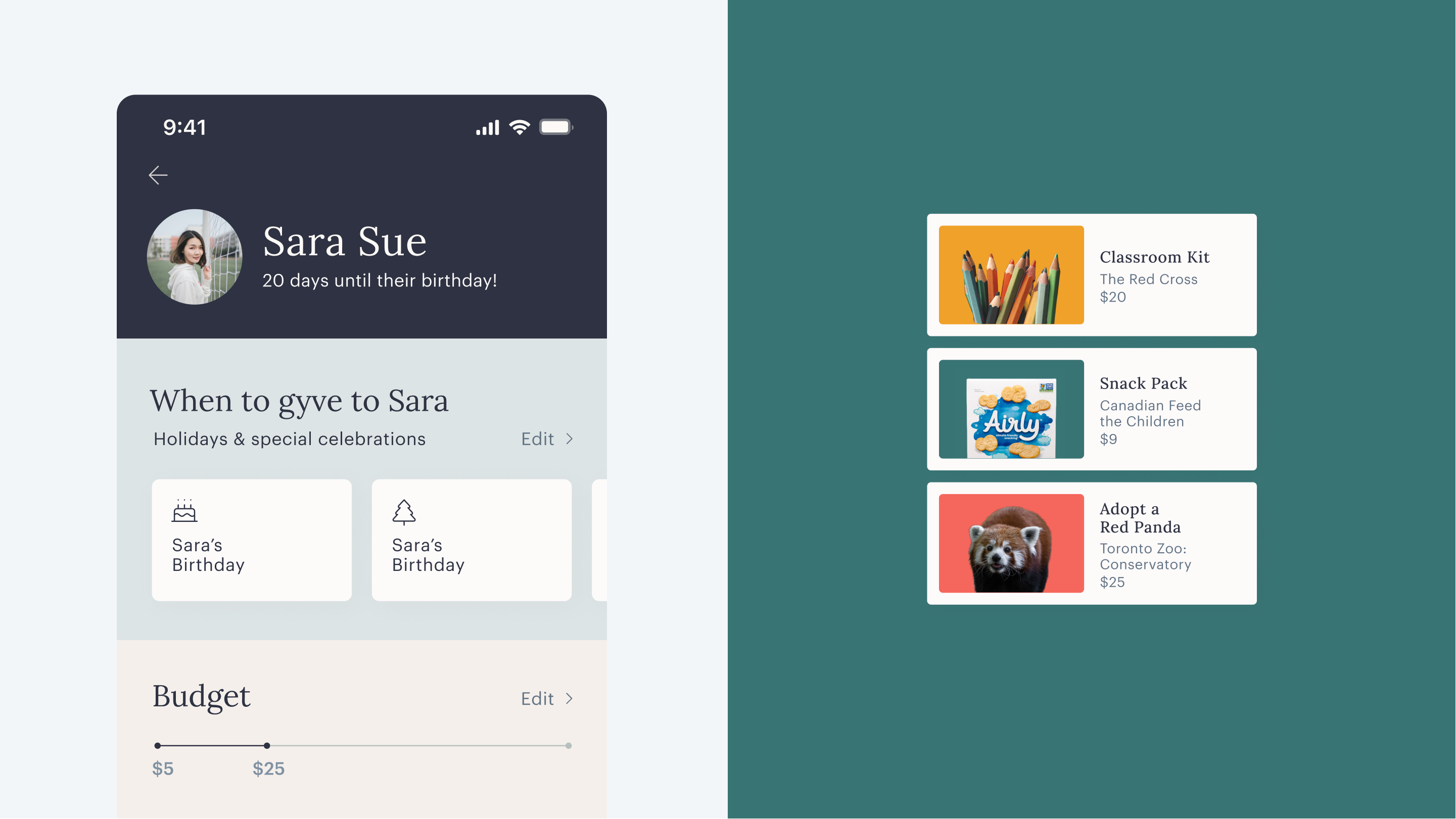
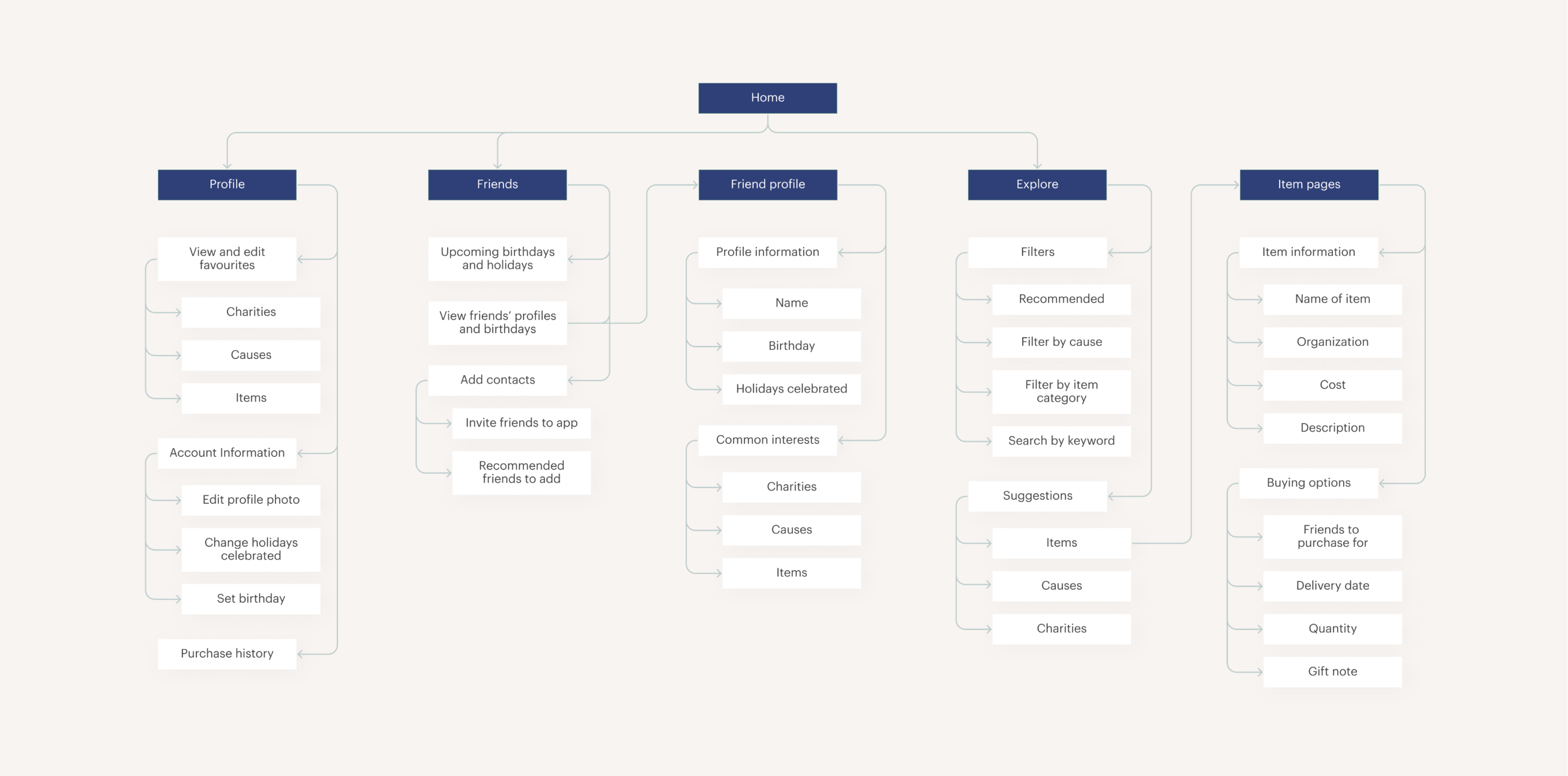
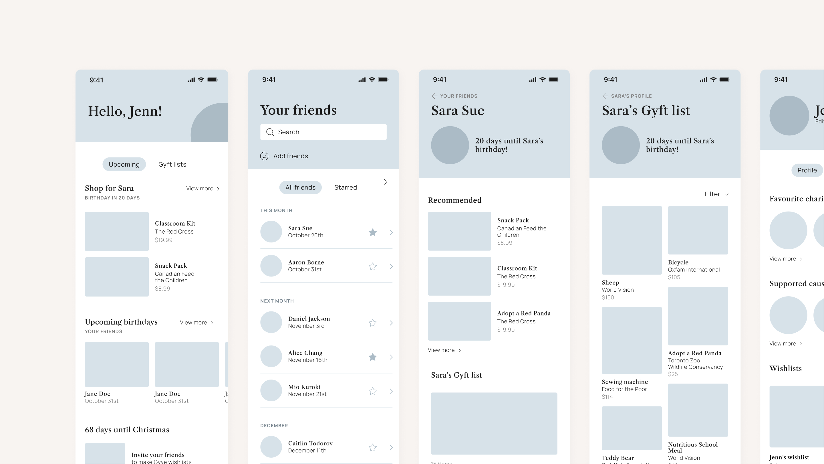
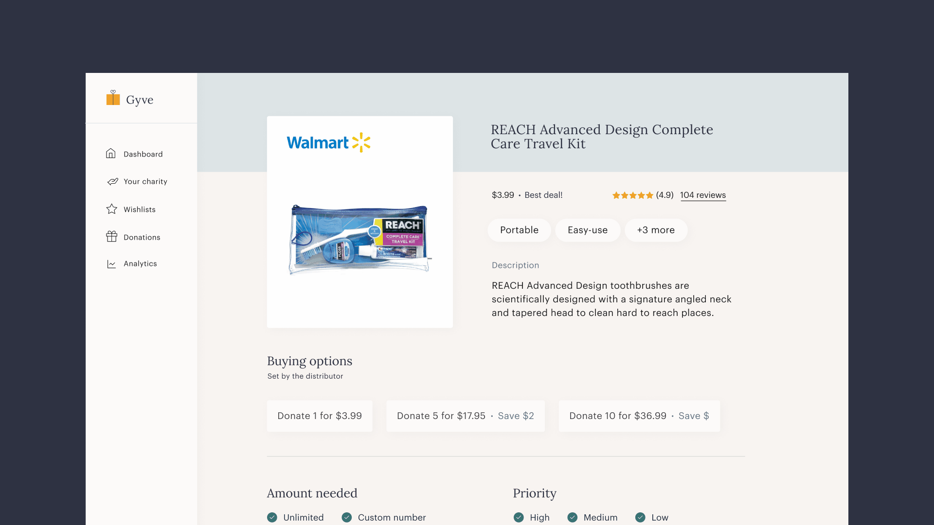
Through the mobile app, individuals are encouraged to explore various causes and charities to customize their interests and tailor their profiles. They are presented with wish lists curated by verified charities and receive gift recommendations for friends based common interests and price range. The platform presents the opportunity to highlight local shops, partner with businesses, and support charities in need.

Three screens A gif of itinerary suggestions

Process

Competitive Analysis

The original brief was to design a gift-giving mobile application that incorporated automation. However, competitive analyses revealed that the market was already saturated with apps that allowed users to input their birthdays and create wish lists. Thus, I reframed the product opportunity to make gift giving more personalized and intentional.

Competitive analysis

Key insights

Performing research enabled me to discover and outline various key insights:

Most apps were ineffective at encouraging regular and continuous gift-giving

Users responded positively to personalized experiences and automated features

There was a lack of platforms that allowed charities to communicate their direct needs

Information Architecture

I structured the mobile application into four main sections. The homepage offers a personalized dashboard and connects to three other sections: the user’s profile, an overview of their friends, and an exploration page for causes and charities. This selection was curated to emphasize connectivity and discovery, providing users with opportunities to tailor their interests and stay up-to-date with their social circles.

Information architecture

Wireframes

I created rough wireframes and layout options to prioritize user experience, hierarchy, and usability before incorporating visual identity. This allowed me to explore flows such as wish list customization, gifting based on events, scheduling purchases, and tracking donations.

Wireframes

Visual Identity

Logo

The logo is representative of the main aspects of the mobile application, combining a heart and a present to symbolize charitable giving.

Logo (combination of a heart and a gift)

Colours & Typography

In the colour scheme, the blues symbolize stability and trustworthiness, while the highlight colours add vibrancy with colours adopted in a high contrast manner to prioritize accessibility. I also used typefaces that were highly legible, and balanced a serif with a sans serif. The design system evokes a playful yet trustworthy tone that resonates with individuals interested in intentional giving.

Colours and typography

Web App

Overview

In parallel to the mobile application, I designed a web app interface for charities to customize their profiles and wish lists. It allows charities establish the parameters to fit their needs and receive tailored support from users. Designing for both ends of the ecosystem encouraged the understanding of multiple user needs to build a connected experience.

Web app screens

Takeaways

The Audience

Creating for both ends encouraged me to consider different perspectives and emphasize alignment. The mobile application for individuals and web app for charities both empowered the users to customize the experience and build connection with their communities.

Prioritization

While designing a zero-to-one product, it was essential to narrow in on the necessary elements as first priority, which I achieved through information architecture and wireframes. As I translated them into a high-fidelity prototype, I was able to focus on iterative improvement every step of the way.

Web app screens

Return to Homepage